La Petite Mort subverts typographic norms through Figure-Ground manipulation, encouraging a richer exploration of their semantic meaning.
Are
Are
you
you
ready?
ready?


STAKEHOLDER
STAKEHOLDER
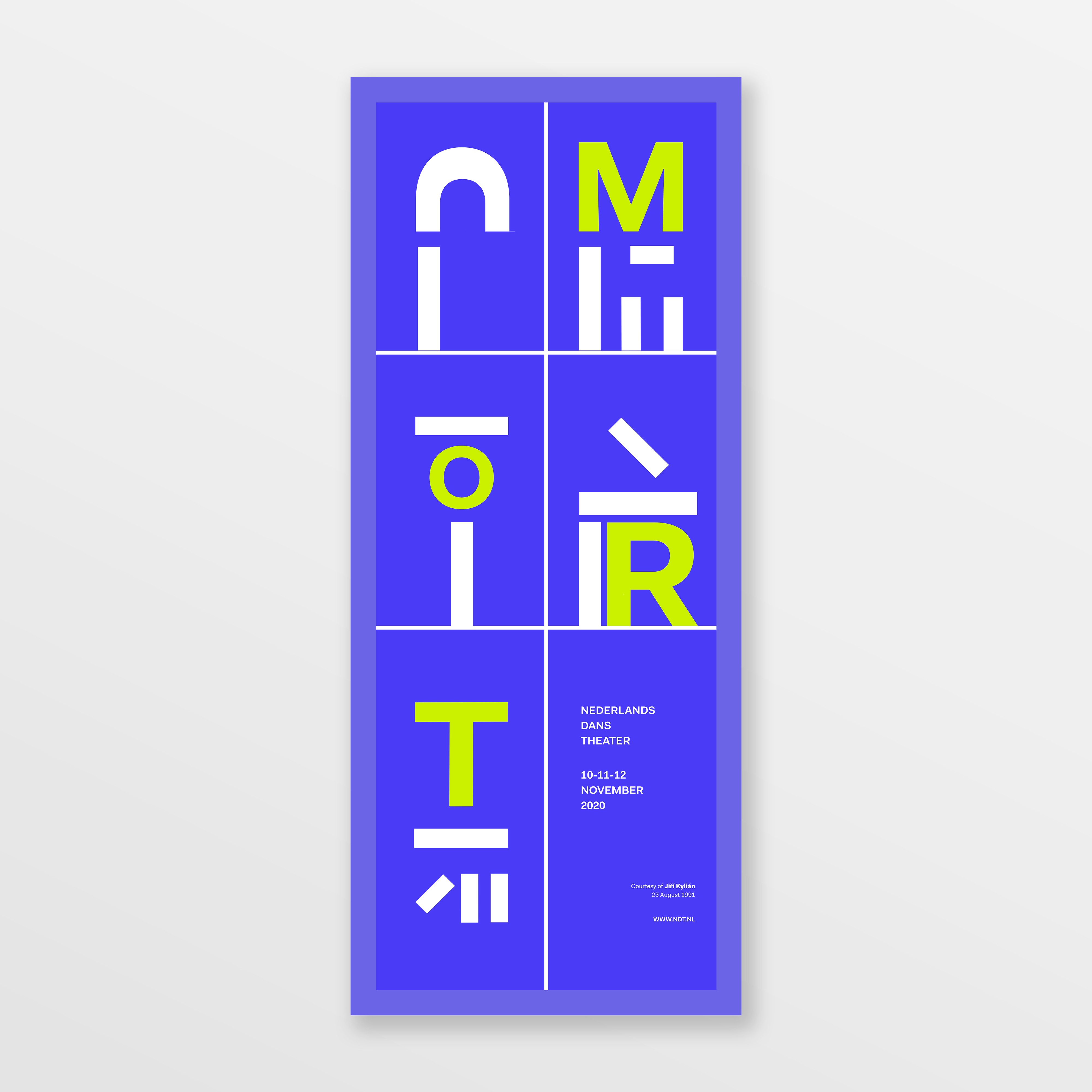
Nederlands Dans Theater
ROLE
Brand Strategist + Graphic Designer
Brand Strategist + Graphic Designer
TOOLS
TOOLS
Adobe Illustrator + Photoshop
Adobe Illustrator + Photoshop
Adobe Illustrator + Photoshop
SPAN
SPAN
± 2 Weeks
± 2 Weeks
± 2 Weeks
Exploring the Limits of Legibility
For La Petite Mort, my design experiments focused on pushing the boundaries of legibility while prioritizing readability through text transformations and the Gestalt Principle of Closure. My goal was to explore how far typographic elements could be abstracted before losing meaning while simultaneously developing a more intentional approach to color.
For La Petite Mort, my design experiments focused on pushing the boundaries of legibility while prioritizing readability through text transformations and the Gestalt Principle of Closure. My goal was to explore how far typographic elements could be abstracted before losing meaning while simultaneously developing a more intentional approach to color.
For La Petite Mort, my design experiments focused on pushing the boundaries of legibility while prioritizing readability through text transformations and the Gestalt Principle of Closure. My goal was to explore how far typographic elements could be abstracted before losing meaning while simultaneously developing a more intentional approach to color.
Aligning Aspirations with Execution
During my early lateral experiments, I noticed a disconnect between my graphic aspirations and my execution capabilities. As the Lead Graphic Designer, I revisited the team’s visual grouping exercise, selecting imagery that best captured both our design goals and what we could realistically execute.
To bridge this gap, I used a mood board as a visual tool, defining the art direction with a focus on deconstructed textand its interaction with space, dynamic Figure-Ground relationships that blur the distinction between foreground and background, and bold color applications to enhance contrast and establish hierarchy. These principles guided the design approach, ensuring a balance between conceptual expression and technical feasibility while maintaining the integrity of the visual narrative.
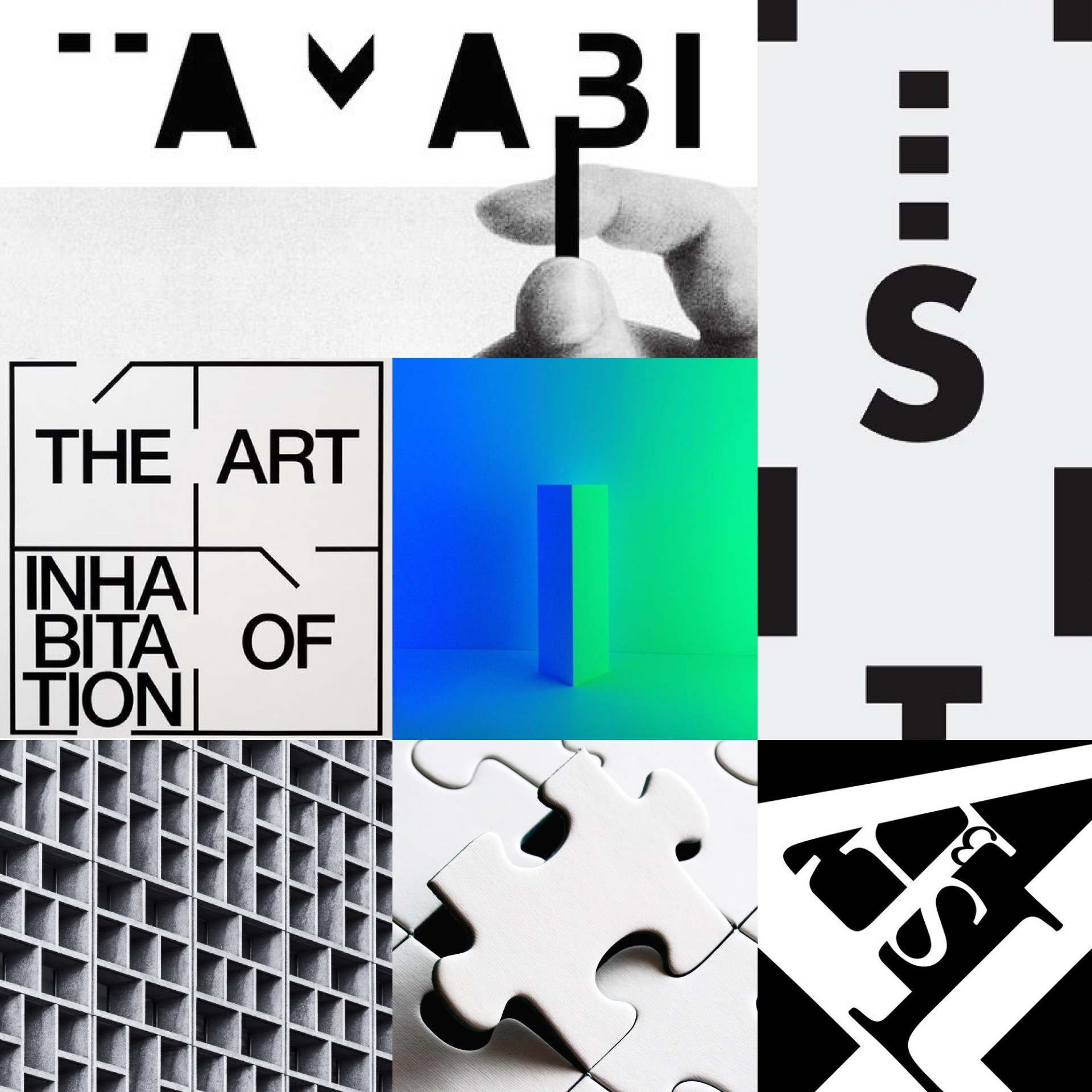
Mood-Board for La Petite Mort
During my early lateral experiments, I noticed a disconnect between my graphic aspirations and my execution capabilities. As the Lead Graphic Designer, I revisited the team’s visual grouping exercise, selecting imagery that best captured both our design goals and what we could realistically execute.
To bridge this gap, I used a mood board as a visual tool, defining the art direction with a focus on deconstructed textand its interaction with space, dynamic Figure-Ground relationships that blur the distinction between foreground and background, and bold color applications to enhance contrast and establish hierarchy. These principles guided the design approach, ensuring a balance between conceptual expression and technical feasibility while maintaining the integrity of the visual narrative.
Mood-Board for La Petite Mort
Art Direction & Concept Development
ESTABLISHING A VISUAL LANGUAGE
The initial poster design focused on deconstructing typography, starting with monochrome forms to establish structure. Once the typographic composition was finalized, I introduced color to create hierarchy and visual impact within the design.
SEMANTIC DISSONANCE: COLOR AS A CONCEPTUAL TOOL
I deliberately chose a buoyant, optimistic color palette to contrast the semantic meaning of “La Mort” (death). This intentional dissonance creates a sense of unease, encouraging the viewer to engage more deeply with the design.
Additionally, I used chartreuse and ultramarine to create a striking contrast, visually reuniting the scattered occurrences of the word “Mort” throughout the composition.

Color Palette for La Petite Mort
ESTABLISHING A VISUAL LANGUAGE
The initial poster design focused on deconstructing typography, starting with monochrome forms to establish structure. Once the typographic composition was finalized, I introduced color to create hierarchy and visual impact within the design.
SEMANTIC DISSONANCE: COLOR AS A CONCEPTUAL TOOL
I deliberately chose a buoyant, optimistic color palette to contrast the semantic meaning of “La Mort” (death). This intentional dissonance creates a sense of unease, encouraging the viewer to engage more deeply with the design.
Additionally, I used chartreuse and ultramarine to create a striking contrast, visually reuniting the scattered occurrences of the word “Mort” throughout the composition.
Color Palette for La Petite Mort
Typography as Visual Exploration
DECONSTRUCTED TYPOGRAPHY & FIGURE-GROUND MANIPULATION
I fragmented and disassociated the title "La Petite Mort", leveraging the interplay between significance and abstraction. By allowing typographic elements to engage in ambiguous Figure-Ground relationships, I created a gradual emergence of meaning, guiding the viewer’s gaze across the composition.

Deconstructed Letter "T" and Separated O in "Mort"
NESTED FRAMING & SPATIAL CONSTRAINTS
To enhance visual hierarchy and structure, I applied wide external margins to contain and frame typographic segments, ensuring a clear separation of elements. Slim internal frames were used to create the illusion of enlarged typography within mini vignettes, adding depth and visual interest. Additionally, typographic elements were positioned to touch and press against frames, reinforcing a sense of compression and expansion within the layout. This approach conveys a dynamic interplay of movement and tension, reflecting the expressive nature of the production while maintaining structural coherence.

Framings in La Petite Mort
TYPOGRAPHIC COMPARTMENTALIZATION
To balance visual dynamism with order, I structured the composition using an asymmetrical grid, allowing for a dynamic yet structured layout that guides the viewer’s gaze. By fragmenting fields of view, the design breaks down complex sensory input into more digestible segments, enhancing readability while maintaining an engaging aesthetic. This approach also strikes a balance between expressive typography and functional clarity, ensuring that the composition remains visually compelling without compromising legibility.

Compartmentalization of Typographic Elements to 5 Partitions
DECONSTRUCTED TYPOGRAPHY & FIGURE-GROUND MANIPULATION
I fragmented and disassociated the title "La Petite Mort", leveraging the interplay between significance and abstraction. By allowing typographic elements to engage in ambiguous Figure-Ground relationships, I created a gradual emergence of meaning, guiding the viewer’s gaze across the composition.
Deconstructed Letter "T" and Separated O in "Mort"
NESTED FRAMING & SPATIAL CONSTRAINTS
To enhance visual hierarchy and structure, I applied wide external margins to contain and frame typographic segments, ensuring a clear separation of elements. Slim internal frames were used to create the illusion of enlarged typography within mini vignettes, adding depth and visual interest. Additionally, typographic elements were positioned to touch and press against frames, reinforcing a sense of compression and expansion within the layout. This approach conveys a dynamic interplay of movement and tension, reflecting the expressive nature of the production while maintaining structural coherence.
Framings in La Petite Mort
TYPOGRAPHIC COMPARTMENTALIZATION
To balance visual dynamism with order, I structured the composition using an asymmetrical grid, allowing for a dynamic yet structured layout that guides the viewer’s gaze. By fragmenting fields of view, the design breaks down complex sensory input into more digestible segments, enhancing readability while maintaining an engaging aesthetic. This approach also strikes a balance between expressive typography and functional clarity, ensuring that the composition remains visually compelling without compromising legibility.
Compartmentalization of Typographic Elements to 5 Partitions
Extending the Visual Identity Across Print Assets
ADVERTISING FLAG: ADJUSTING BALANCE & WHITESPACE
The primary challenge in designing the advertising flag was balancing tight gridlines and typography with surrounding whitespace. To improve readability, I increased negative space around text elements, allowing for better visual separation. I also adjusted grid line weight to create a more balanced composition and refined typographic alignmentto enhance flow and overall cohesion. These refinements improved clarity and readability while preserving the bold, experimental nature of the design.
Advertising Flag for La Petite Mort
PERFORMANCE TICKET: CREATING COHESION ACROSS ASSETS
The initial ticket design lacked a cohesive grid system, causing expressive elements to compete with essential information. After multiple iterations, I implemented a compartmentalized grid to maintain consistency with other assets, ensuring a structured layout. I also separated functional and expressive elements, prioritizing clarity while preserving the design’s artistic intent. To further enhance usability, I moved critical details to the back, allowing the front design to maintain its visual impact without compromising readability. This approach ensured that essential information remained easy to navigate while reinforcing the show’s bold typographic identity.

Front Side of the Performance Ticket

Back Side of the Performance Ticket
ADVERTISING FLAG: ADJUSTING BALANCE & WHITESPACE
The primary challenge in designing the advertising flag was balancing tight gridlines and typography with surrounding whitespace. To improve readability, I increased negative space around text elements, allowing for better visual separation. I also adjusted grid line weight to create a more balanced composition and refined typographic alignmentto enhance flow and overall cohesion. These refinements improved clarity and readability while preserving the bold, experimental nature of the design.
Advertising Flag for La Petite Mort
PERFORMANCE TICKET: CREATING COHESION ACROSS ASSETS
The initial ticket design lacked a cohesive grid system, causing expressive elements to compete with essential information. After multiple iterations, I implemented a compartmentalized grid to maintain consistency with other assets, ensuring a structured layout. I also separated functional and expressive elements, prioritizing clarity while preserving the design’s artistic intent. To further enhance usability, I moved critical details to the back, allowing the front design to maintain its visual impact without compromising readability. This approach ensured that essential information remained easy to navigate while reinforcing the show’s bold typographic identity.
Front Side of the Performance Ticket
Back Side of the Performance Ticket
Takeaways
Through La Petite Mort, I explored the intersection of conceptual expression and usability, reinforcing the importance of balancing functional and expressive design. This project highlighted the role of typography as both a communicative and visual tool, demonstrating how legibility can coexist with abstraction to create a compelling experience. A successful design does not prioritize aesthetics over function but instead finds harmony between the two. My approach consistently integrates both aspects, ensuring that my work remains conceptually rich, visually engaging, and user-centered.
Through La Petite Mort, I explored the intersection of conceptual expression and usability, reinforcing the importance of balancing functional and expressive design. This project highlighted the role of typography as both a communicative and visual tool, demonstrating how legibility can coexist with abstraction to create a compelling experience. A successful design does not prioritize aesthetics over function but instead finds harmony between the two. My approach consistently integrates both aspects, ensuring that my work remains conceptually rich, visually engaging, and user-centered.
Through La Petite Mort, I explored the intersection of conceptual expression and usability, reinforcing the importance of balancing functional and expressive design. This project highlighted the role of typography as both a communicative and visual tool, demonstrating how legibility can coexist with abstraction to create a compelling experience. A successful design does not prioritize aesthetics over function but instead finds harmony between the two. My approach consistently integrates both aspects, ensuring that my work remains conceptually rich, visually engaging, and user-centered.
Smooth Scroll
This will hide itself!
This will hide itself!
Smooth Scroll
This will hide itself!
This will hide itself!
Smooth Scroll
This will hide itself!
This will hide itself!